How to Choose the Right Color Palette for Your Home
Choosing the right color palette for your home can feel overwhelming. With endless shades, undertones, and finishes available, it’s easy to get stuck or second-guess your choices. But here’s the truth: selecting colors isn’t just about design — it’s about creating a space that feels comforting, cohesive, and deeply personal. The right palette can transform how your home flows, how spacious it feels, and even how you experience each day inside it.
Rather than thinking of color as a purely decorative choice, think of it as a foundation. Your walls, accents, and furnishings all work together to influence the mood of a space. Whether you want calm and cozy, bright and energizing, or timeless and minimal, it all starts with color. In this blog, we’ll break down exactly how to choose the right color palette for your home — from mood boards and color theory to testing samples and avoiding common design mistakes. By the end, you’ll feel confident building a palette that looks cohesive and feels truly yours.
Why Your Color Palette Matters
Colors are more powerful than most people realize. They don’t just add visual interest — they influence how we feel and interact with our surroundings. A soft, neutral palette can make a small home feel open and airy, while rich, saturated colors can create intimacy and warmth.
On a practical level, having a cohesive palette ensures your home feels intentional instead of disjointed. Every room connects to the next, giving your space flow. This is especially important in small homes and open-plan layouts, where colors have a big impact on the perception of size and comfort. When chosen thoughtfully, a color palette anchors your decor and makes layering furniture, art, and textiles effortless.
Step One – Start with Inspiration and Mood
Before looking at paint swatches or samples, pause and ask yourself: how do I want my home to feel? Inspiration can come from anywhere — Pinterest boards, travel memories, favorite clothing colors, or even nature. A seashell might spark ideas for sandy neutrals and soft blues, while a vibrant textile could inspire bold jewel tones.
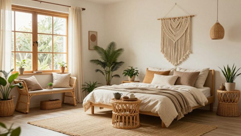
Defining a mood is the first step. Do you want your home to feel calming and restful? Consider neutrals, soft greens, or muted blues. Prefer energy and vibrancy? Brighter hues like mustard, terracotta, or coral may suit you better. Cozy, earthy tones like warm browns and terracottas work beautifully for grounding spaces.
When you define a mood, you’re giving your palette purpose — and that makes it much easier to narrow down choices.
Step Two – Understand the Basics of Color Theory
Once you have inspiration, it helps to know a little about color theory. Warm tones (reds, yellows, oranges) create energy and warmth, while cool tones (blues, greens, purples) feel calming and serene. Neutral tones fall somewhere in between, offering balance.
Two simple strategies can help: complementary colors (opposites on the color wheel, like blue and orange) for high contrast, or analogous colors (next to each other, like green and blue) for harmony.
When building your palette, aim for balance between dominant, secondary, and accent shades. This ensures one color leads, one supports, and one adds personality — preventing your space from looking chaotic.
Step Three – Choose a Neutral Base
Every successful palette begins with a neutral foundation. Neutrals anchor your design and make it easier to swap decor without constantly repainting. Options like white, beige, grey, or soft taupe are timeless. Sage green and muted clay tones also work beautifully as modern neutrals.
The benefit of neutrals is flexibility — they keep your space feeling calm while allowing bold accents to shine. They’re also forgiving in small homes, helping rooms look larger and more open.
Step Four – Layer in Accent Colors
Once you’ve chosen a base, it’s time to add accents. Accent colors bring personality and life into your palette. Think pillows, rugs, artwork, or even an accent wall.
A helpful rule here is the 60-30-10 rule. This means 60% of the space should be your dominant neutral, 30% your secondary color, and 10% your accent. For example, if your walls are light grey (60%), your sofa and rug might introduce navy (30%), and accent pillows or art could add mustard yellow (10%).
This formula prevents overcomplication while ensuring your space has dimension and interest. It also keeps your palette cohesive throughout the home.
Step Five – Test Before You Commit
Never skip this step: always test your colors before finalizing. Paint swatches on walls or bring fabric samples into your space. Then, observe them at different times of the day. Morning light, afternoon sun, and evening lamps will all change how a color looks.
What looks perfect in the store might feel completely different under your home’s lighting. Living with samples for a few days prevents costly mistakes and helps you see which shades truly feel right.
Step Six – Make It Cohesive Across the Home
A color palette isn’t just about one room — it’s about the whole home. Open-plan layouts especially benefit from consistency. Using a common thread of color, whether in trims, textiles, or accents, ties everything together.
This doesn’t mean every room should look identical. Instead, carry tones across spaces in small ways — a navy throw in the living room, navy pillows in the bedroom, or navy art in the hallway. This creates visual flow while still allowing variety.
Mistakes to Avoid When Choosing Colors
Many homeowners fall into the trap of choosing colors based on trends alone. While it’s fun to experiment, building your entire palette around a passing trend can leave your space feeling dated quickly.
Another mistake is overloading bold colors without balance. A room full of brights can feel chaotic instead of stylish. Similarly, ignoring natural light can result in colors that look dull or oppressive.
Avoiding these top interior design mistakes ensures your palette works long-term while still feeling personal and inviting.
Bringing Personality into Your Palette
The most beautiful homes aren’t just stylish — they’re personal. Don’t be afraid to weave in your favorite colors, even if only as accents. A soft blush throw blanket, a vibrant turquoise vase, or a piece of artwork can tie your personality into the design.
Incorporating heirlooms, handmade textiles, or meaningful art ensures your palette doesn’t just look cohesive, but also feels authentic. The goal isn’t perfection — it’s a reflection of who you are.
Conclusion
At the end of the day, learning how to choose the right color palette for your home is about creating a space that feels both cohesive and personal. Your palette influences mood, comfort, and flow, but it also reflects your unique style. Start with inspiration, ground your design in neutrals, layer accents thoughtfully, and always test before committing.
Remember, small adjustments in color can make a huge difference in how your home feels. Even the tiniest apartment or coziest home office can feel bigger, brighter, and more welcoming with the right palette.
When decorated with intention, your home doesn’t just become stylish — it becomes a sanctuary. The right color palette isn’t about chasing trends or achieving perfection. It’s about crafting a space that feels calm, cohesive, and authentically yours.


